I Couldn’t Resist

…making a bad pun, apparently. See, for this butterfly:
rainbow butterfly
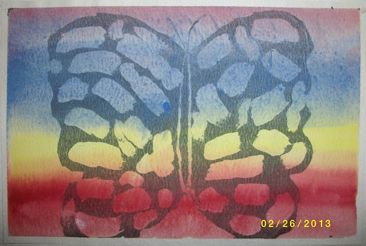
I used the tempera/India ink resist method to create the black outlines.

If you don’t know how an ink resist is done, here is the method I use:

  1. Draw the basic outlines, mainly of the parts that need to be black in the final product.
  2. Fill in the parts that need to stay white with a white tempera/gouache paint. Let that dry at least overnight.
  3. Cover the entire paper with India ink and let it dry.
  4. Rinse the paper under water and gently scrub the underlying paint off.
  5. Let the paper dry, then use watercolors to fill in the other colors.

It takes a few days, but I like how it turned out. Probably should have used a tougher paper to stand up to the washing, but it works well enough.

More Drawing Practice

Practice definitely does make better. Remember the charcoal drawings I did? Well, the same day I was getting the charcoal paper and drawing board I picked up a pack of Conté crayons. Slightly more compressed than the charcoal sticks, I think. Not really sure what the difference is other than they are slightly smaller.

Anywho, I had really liked the conté drawings in my art class, and decided to give it a go with a picture off my phone:

N conte portrait

Still slightly wonky, but recognizable as a person at least. Cute, right?

Back To The Drawing Board

As in, I got myself a new drawing board. But perhaps I should back up to what lead me to get one in the first place.

Sometimes I go to the art store looking for something in particular. Most of the time I find it. Usually I waste a bit of time by wandering through every single aisle. Occasionally I pick up something that is totally not on my list. One particular day that happened to be some charcoal sticks. I hadn’t drawn with charcoal since my grade 9 art classes, so I grabbed a pack each of black and white.

Those sticks sat around a few weeks in a bag on my desk, waiting for a project. I finally took some time to sit down with them, a pastel paper pad, and a CD cover I’m not going to name because it came out way wrong. This is what came of that:

Charcoal portrait 1

Pastel textured paper seems a bit too texturized for the charcoal. So I went back and picked up a small pad of actual charcoal paper which worked much better. I also picked up a drawing board so i can angle the paper and not have to worry about it bending. I’ve never been very good at drawing flat. Just look at the original picture for proof. Using a different picture in the album cover, I redeemed myself slightly with this picture:

Charcoal portrait 2

I think I need a wee bit more practice. Bonus points to anyone who can figure out who these terrible portraits are supposed to be.