
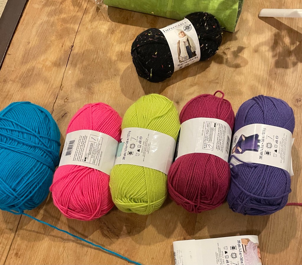
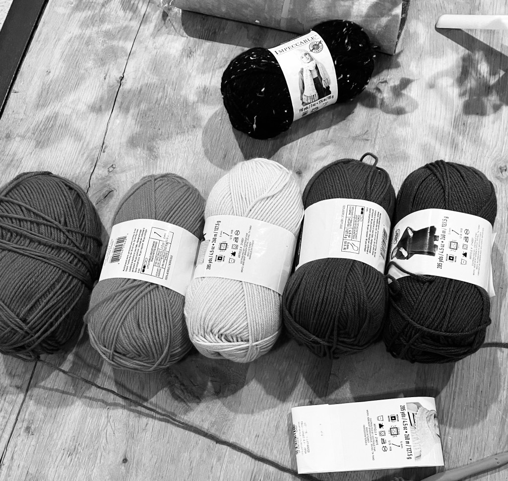
A tip for choosing colors, especially colors for stripes or other types of patterns, that I learned in either my color theory class or my first photoshop class: take a picture and desaturate it to black and white.
A bit easier to do now than it was back then when it involved actually getting out a digital camera, taking a picture, importing it to photoshop, and then changing the color. And I acknowledge that I was lucky to be able to do that a bit over a decade ago. Imagine that same process with black and white film and having to either develop it or take it to Walgreens. Yeah, pretty sure no one would do that.

I was able to make each of these pictures in a matter of seconds right on my phone, and it makes all the difference. This shows you which ones are similar tones and can help you get whatever effect you are going for.
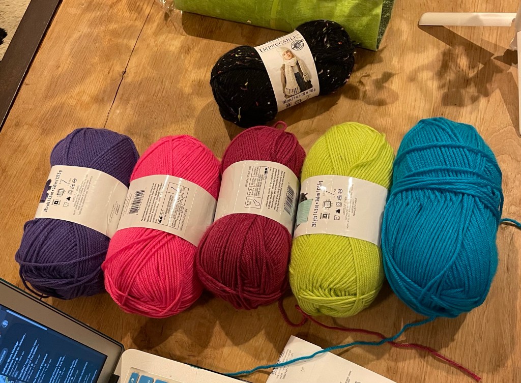

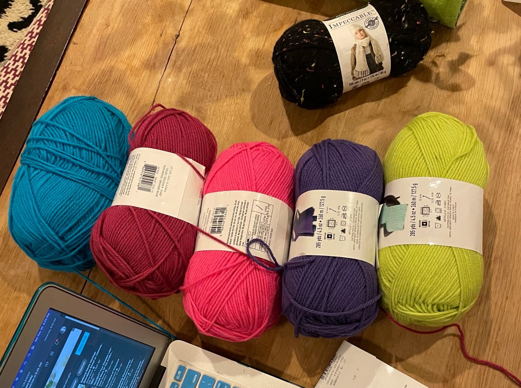
I wanted contrast in my stripes, so I chose this order. If I had wanted more of a gradient, even with the bright colors, I could’ve rearranged the first group to pull the lightest out of the center and place it to the end.
